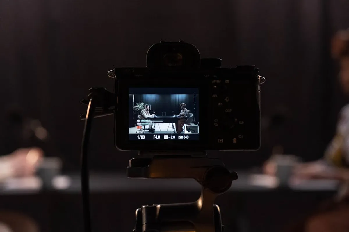
For enthusiasts who view television not just as a narrative medium but as a visual art form, identifying shows that prioritize cinematography is key. This curated selection focuses on series where the camera work, lighting, composition, and color grading are integral to the storytelling, often elevating the narrative or establishing a distinct mood. These productions move beyond functional shot-reverse-shot sequences, instead employing visual language to convey character psychology, thematic depth, and immersive atmosphere. The value lies in recognizing productions that invest in their visual grammar, offering a viewing experience that rewards close attention to detail and artistic execution.
What to Look For in Visually Driven Television
When assessing a TV show for its cinematographic merit, several elements warrant attention. First, consider the **lighting**: is it naturalistic, stylized, or symbolic? How does it shape mood, highlight characters, or obscure details? Second, **composition and framing** are critical. Does the director of photography (DP) use wide shots to convey scale, tight close-ups for intimacy, or unusual angles to disorient? Look for deliberate choices in how subjects are placed within the frame and how negative space is utilized. Third, **camera movement**—or its absence—is a powerful tool. Tracking shots, steady cams, handheld work, or static frames all serve different narrative purposes. Fourth, **color grading** dictates the overall visual tone; a muted palette might suggest bleakness, while vibrant hues can convey energy or fantasy. Finally, the **use of lenses and depth of field** can manipulate perspective, drawing focus to specific elements or creating a dreamlike blur. Shows excelling in these areas demonstrate a cohesive visual strategy that enhances the narrative without overshadowing it, making deliberate choices that contribute to the overall artistic impact.
1. Breaking Bad
Breaking Bad is renowned for its meticulous visual storytelling, where every frame feels deliberately composed. Cinematographers Michael Slovis and Arthur Albert employed a distinct visual language, characterized by wide, expansive shots of the New Mexico landscape, often dwarfing the characters to emphasize their moral isolation or the vastness of their criminal enterprise. The show made iconic use of low-angle shots, particularly for Walter White, to convey his growing power and menace. Color grading was consistently used to reflect character arcs and thematic shifts, with specific palettes associated with different characters and their evolving moral states. The series frequently utilized extreme close-ups on objects, creating suspense and drawing attention to critical plot details, making mundane items feel significant.
Best for: Viewers who appreciate a strong visual metaphor, deliberate color theory, and an almost cinematic approach to episodic television.
Pros: Consistent visual style across seasons; innovative use of perspective and framing; highly effective use of landscape as a character; meticulous attention to detail in set design and prop placement that enhances visual narrative.
Cons: The visual style, while distinctive, can sometimes feel overtly stylized for some viewers who prefer a more naturalistic look.
Verdict: Breaking Bad stands as a masterclass in how cinematography can elevate a crime drama, transforming a compelling story into an iconic visual experience through its consistent aesthetic and symbolic choices.
2. Mindhunter
David Fincher’s signature visual style is deeply ingrained in Mindhunter, executed by cinematographers Erik Messerschmidt and Dana Gonzales. The show is characterized by its precise, symmetrical compositions, often placing characters centrally within the frame, which creates a sense of order amidst the psychological chaos they investigate. Lighting is predominantly dark and moody, utilizing practical light sources and deep shadows to enhance the grim, introspective tone. The color palette is desaturated, emphasizing the cold, clinical nature of the FBI’s early psychological profiling efforts. Camera movements are slow, deliberate, or often static, allowing scenes to unfold with an unnerving stillness that forces the viewer to confront the dialogue and performances directly. This aesthetic choice contributes significantly to the show's intense, unsettling atmosphere.
Best for: Fans of dark, atmospheric thrillers and those who appreciate precise, controlled compositions and subtle visual tension.
Pros: Masterful use of natural and practical lighting; consistently strong, deliberate framing; effective creation of a pervasive sense of dread through visual cues; high attention to detail in period-accurate settings.
Cons: The consistent visual bleakness may be too oppressive for some, offering little visual relief from the heavy subject matter.
Verdict: Mindhunter’s cinematography is a cornerstone of its identity, using visual discipline to build an atmosphere of psychological unease that is as compelling as its narrative.
3. The Crown
The Crown presents a grand, stately visual spectacle, befitting its royal subject matter. Cinematographers like Adriano Goldman and Frank Lamm craft a look that is both opulent and often isolating. The series frequently employs wide, sweeping shots of palaces, landscapes, and grand interiors, emphasizing the scale of the monarchy and the weight of tradition. Lighting is typically soft and elegant, often mimicking natural light through large windows, creating a sense of historical authenticity and grandeur. Composition is formal and balanced, often using deep focus to capture the intricate details of period sets and costumes. Color grading leans towards rich, muted tones, reflecting the historical period while maintaining a luxurious feel. The camera movement is generally smooth and deliberate, reinforcing the sense of gravitas and decorum associated with the British royal family.
Best for: Viewers who appreciate lavish historical productions, symmetrical compositions, and cinematography that conveys scale and formality.
Pros: Exceptional production design complemented by precise framing; consistent visual grandeur; effective use of natural light for historical realism; strong sense of place and period conveyed through visuals.
Cons: The formal, often static camera work can sometimes feel less dynamic than contemporary styles, potentially making some scenes feel more observational than immersive.
Verdict: The Crown's cinematography is a testament to its ambition, successfully translating the weight and splendor of royal history into a consistently beautiful and impactful visual narrative.
4. Chernobyl
Chernobyl’s cinematography, primarily by Adam Dale, is instrumental in conveying the horror and human cost of the nuclear disaster. The visual style is stark, desaturated, and often claustrophobic, immersing the viewer in the grim reality of the event. Lighting is frequently dim and oppressive, utilizing practical light sources like flashlights and emergency lamps to create a sense of urgency and danger. Composition often features tight close-ups on faces to capture the raw emotion and fear, contrasted with wide shots that emphasize the scale of the destruction and the vast, empty landscapes of the exclusion zone. The color palette is deliberately muted, dominated by grays, browns, and sickly greens, reinforcing the toxic environment. Camera movement is often handheld in chaotic scenes, lending a visceral, documentary-like quality, while static shots are used to underscore moments of quiet despair or bureaucratic rigidity.
Best for: Those who value cinematography that enhances realism, builds tension, and unflinchingly portrays human suffering and environmental devastation.
Pros: Visceral and immersive visual style; effective use of color and light to convey danger and despair; strong sense of authenticity and urgency; powerful juxtaposition of human scale against environmental catastrophe.
Cons: The relentlessly bleak and desaturated aesthetic, while appropriate for the subject, offers little visual respite and can be emotionally draining.
Verdict: Chernobyl’s cinematography is a powerful and essential component of its narrative, using visual austerity and realism to amplify the devastating impact of its historical subject matter.
5. Ozark
Ozark’s distinctive visual style, established by DPs like Ben Kutchins and Armando Salas, is characterized by its dark, moody aesthetic and pervasive blue-green color palette. This heavy color grading immediately establishes a sense of dread and moral ambiguity, reflecting the Byrde family’s entanglement in money laundering. The show frequently employs wide, sweeping shots of the Ozark landscape, often from a high angle, which visually traps the characters within their environment and emphasizes the expansive, isolated nature of their criminal operations. Lighting is often low-key, creating deep shadows that conceal and reveal, mirroring the characters' secrets. Camera movement is typically smooth and deliberate, often tracking characters through complex environments, drawing the viewer into their increasingly dangerous world. The compositions are often asymmetrical, adding to the unsettling atmosphere.
Best for: Viewers who appreciate a strong, consistent color palette that defines a show's mood, and cinematography that uses landscape to enhance narrative tension.
Pros: Highly distinctive and consistent visual identity; effective use of color to create a sense of dread; strong compositions that emphasize character isolation; smooth, immersive camera work.
Cons: The pervasive blue-green filter, while iconic, can sometimes feel monochromatic and visually repetitive over multiple seasons.
Verdict: Ozark’s cinematography is integral to its identity, using a unique color grade and expansive framing to create a visually oppressive world that mirrors its characters' deepening moral quagmire.
6. The Queen's Gambit
The Queen's Gambit, with cinematography by Steven Meizler, is a visually opulent and highly stylized series that uses its camera work to immerse viewers in Beth Harmon's world of competitive chess and personal struggle. The show employs a rich, vibrant color palette, particularly in its costume and set design, which is then meticulously lit to create a warm, inviting, yet sometimes melancholic atmosphere. Composition is often precise and symmetrical, reflecting the order and strategy of chess, but also uses dynamic angles and close-ups to convey Beth's internal state and the intensity of her games. The series is particularly noted for its innovative use of camera movement during chess matches, often tracking pieces or moving around the board to create a sense of speed and mental agility. Flashbacks and drug-induced hallucinations are rendered with distinct visual treatments, differentiating them from the main narrative.
Best for: Fans of vibrant period pieces, stylized visuals, and innovative approaches to depicting abstract concepts like strategic thinking.
Pros: Visually rich and dynamic; effective use of color and lighting to convey mood and period; innovative camera work during chess sequences; strong visual differentiation between reality and internal states.
Cons: The highly polished and stylized look, while beautiful, occasionally leans towards a glossy aesthetic that some might find less raw or authentic.
Verdict: The Queen's Gambit is a triumph of visual design, where cinematography actively translates the internal world of a chess prodigy into a captivating and emotionally resonant experience.
7. True Detective (Season 1)
The first season of True Detective, directed by Cary Joji Fukunaga and shot by Adam Arkapaw, is a landmark in television cinematography, particularly for its atmospheric and haunting visuals. The series is famed for its long, unbroken takes, most notably the six-minute tracking shot in episode four, which immerses the viewer directly into the chaotic action. Lighting is often naturalistic and moody, utilizing the oppressive heat and humidity of rural Louisiana to create a palpable sense of decay and despair. The color palette is desaturated, dominated by earthy tones, enhancing the grim, existential themes. Composition frequently uses wide shots of the desolate landscape, emphasizing the isolation and the pervasive sense of evil. The camera work is fluid and deliberate, often following characters through their investigations, creating a voyeuristic intimacy that underscores the psychological depth of the narrative.
Best for: Viewers who appreciate ambitious long takes, atmospheric naturalism, and cinematography that uses environment as a character.
Pros: Groundbreaking long takes that enhance immersion; masterful use of natural light and shadow; strong sense of place and atmosphere; visually reinforces the show's dark philosophical themes.
Cons: The deliberate pacing and often bleak visual tone can be challenging for those accustomed to faster-cut, more conventionally dynamic shows.
Verdict: True Detective Season 1 set a new benchmark for television cinematography, proving that episodic content could achieve the visual ambition and artistic depth typically reserved for feature films.
8. Mr. Robot
Mr. Robot, primarily shot by Tod Campbell and Tim Norman, employs a highly distinctive and often unsettling visual language that mirrors its protagonist Elliot Alderson's fractured psyche. The show is known for its unconventional framing, frequently placing characters in the extreme corners of the frame, leaving vast amounts of negative space. This creates a sense of isolation, paranoia, and psychological discomfort, visually representing Elliot's alienation from society. Lighting is often stark and artificial, particularly in the urban settings, contributing to a cold, clinical atmosphere. The color palette is generally muted, with occasional bursts of neon or specific color filters to denote different realities or states of mind. Camera movement is typically controlled and deliberate, often static, allowing the unsettling compositions to speak for themselves, or employing subtle, precise dollies that enhance the feeling of being watched.
Best for: Audiences who appreciate experimental framing, visual symbolism, and cinematography that actively reflects a character’s mental state.
Pros: Highly original and consistent visual style; effectively conveys psychological themes through framing; innovative use of negative space; strong visual identity that sets it apart from contemporaries.
Cons: The extreme framing and often static camera can be disorienting or alienating for some viewers, requiring an adjustment to its unique visual grammar.
Verdict: Mr. Robot's cinematography is a bold artistic statement, using visual subversion to create a deeply immersive and unsettling experience that is inseparable from its complex narrative.
9. The Handmaid's Tale
The Handmaid's Tale, with cinematographers like Colin Watkinson and Zoë White, creates a visually stunning yet deeply disturbing world. The show is characterized by its painterly compositions, often drawing inspiration from Dutch Golden Age paintings, particularly in its use of light and shadow. The color palette is highly symbolic, with the muted reds of the Handmaids' cloaks and the teal of the Marthas standing out against desaturated backgrounds, visually reinforcing the oppressive social hierarchy. Lighting is often naturalistic, emphasizing the stark beauty and harsh realities of Gilead. Composition frequently employs tight close-ups on June's face to convey her internal struggle, contrasted with wide shots that emphasize the regimentation and loss of individuality. Camera movement is typically slow and deliberate, or static, allowing the oppressive atmosphere and emotional weight of each scene to fully register.
Best for: Viewers who appreciate highly symbolic color palettes, classical compositions, and cinematography that conveys oppression and emotional depth.
Pros: Visually striking and consistent aesthetic; powerful use of color for thematic purposes; strong compositions that evoke historical art; effective in conveying both beauty and horror.
Cons: The deliberate pacing and often bleak visuals, while appropriate, can contribute to a heavy and emotionally challenging viewing experience.
Verdict: The Handmaid's Tale uses its exquisite cinematography to build a world that is both aesthetically captivating and profoundly unsettling, making its visual language as critical as its narrative.
10. Atlanta
Atlanta, primarily shot by Christian Sprenger, is celebrated for its distinctive blend of surrealism, realism, and understated visual humor. The cinematography often employs long, static takes that allow scenes to breathe and awkward moments to linger, contributing to the show's unique comedic and dramatic rhythm. Lighting is often naturalistic, reflecting the everyday environments of Atlanta, but can shift dramatically to create dreamlike or unsettling sequences. The color palette is generally warm and earthy, grounding the show in its specific cultural and geographical context. Composition is frequently loose and observational, but can also become highly stylized or surreal when the narrative veers into more experimental territory. The camera movement is often subtle, following characters unobtrusively, or it can be deliberately jarring to underscore a moment of absurdity or tension.
Best for: Those who appreciate cinematography that balances naturalism with surrealism, and uses visual subtlety to enhance comedic timing and dramatic impact.
Pros: Unique visual rhythm that supports its genre-bending narrative; effective use of natural light; ability to seamlessly transition between realistic and surreal aesthetics; strong sense of place.
Cons: The often understated and observational style might be perceived as less overtly "cinematic" by viewers looking for more grand or dramatic visual statements.
Verdict: Atlanta’s cinematography is a masterclass in understated brilliance, using a flexible and intelligent visual approach to create a show that is as visually rich as it is narratively complex.
11. Barry
Barry, with cinematographers like Paula Huidobro, employs a sophisticated visual style that adeptly navigates the show's tonal shifts between dark comedy, intense drama, and action. The series often uses dynamic camera movement, particularly Steadicam work, to follow Barry through his increasingly complicated life, creating a sense of fluid immersion. Lighting is versatile, ranging from bright, naturalistic scenes in acting classes to dark, moody lighting in criminal underworld sequences, effectively delineating the two halves of Barry's life. Composition is often precise, using wide shots to emphasize Barry's isolation or tight framing to build tension during confrontations. The color palette is generally realistic but can become highly stylized during dream sequences or moments of psychological breakdown, using saturated hues or stark contrasts to denote shifts in reality. The visual storytelling is often economical, conveying information or character emotion without relying heavily on dialogue.
Best for: Viewers who enjoy cinematography that is dynamic, adaptable to genre shifts, and uses visual cues to deepen character psychology and narrative complexity.
Pros: Highly adaptable visual style that supports tonal shifts; excellent use of camera movement for immersion and tension; effective visual differentiation of Barry's dual lives; strong visual economy.
Cons: The visual style is less overtly "signature" than some other shows on this list, prioritizing versatility and narrative support over a singular, immediately recognizable aesthetic.
Verdict: Barry's cinematography is a nuanced and intelligent component of its success, using visual flexibility to enhance its unique blend of humor, pathos, and violence.
12. Severance
Severance, with cinematographers Jessica Lee Gagné and Adam Bricker, crafts a chillingly pristine and unsettling visual world that perfectly mirrors its dystopian corporate setting. The show is defined by its stark, minimalist aesthetic, characterized by symmetrical compositions, clean lines, and an almost clinical sense of order. Lighting is often bright, fluorescent, and artificial within the Lumon offices, creating a sense of sterile surveillance, contrasted with more naturalistic but still muted lighting in the "outie" world. The color palette is predominantly cool, dominated by whites, grays, and blues, reinforcing the corporate control and emotional suppression. Camera movement is typically slow, deliberate, and often uses tracking shots through the labyrinthine corridors of Lumon, emphasizing the characters' confinement. The visual design is integral to the show's themes of corporate control and identity fragmentation.
Best for: Fans of dystopian sci-fi, minimalist aesthetics, and cinematography that uses visual design to create a pervasive sense of unease and control.
Pros: Highly distinctive and consistent visual language; effective use of color and lighting to convey thematic ideas; precise and unsettling compositions; immersive tracking shots that enhance atmosphere.
Cons: The deliberately cold and sterile visual style, while effective, offers little warmth or visual variety, which might feel monotonous for some viewers.
Verdict: Severance’s cinematography is a masterstroke of world-building, using its meticulous visual design to create a deeply unsettling and memorable dystopian reality.
13. Andor
Andor, featuring cinematographers like Adriano Goldman and Frank Lamm (who also worked on The Crown), stands out for its grounded, gritty, and expansive visual style within the Star Wars universe. The show deliberately eschews the glossy, often green-screen heavy aesthetic of some other franchise entries, opting instead for practical sets, real locations, and naturalistic lighting. Composition is often wide and sweeping, capturing the scale of industrial worlds and oppressive cityscapes, while also using tight, intimate framing to focus on character emotion and tension during covert operations. The color palette is generally muted and realistic, favoring earthy tones and industrial grays, which grounds the sci-fi elements in a tangible reality. Camera movement is often handheld in action sequences, lending a visceral urgency, but also employs deliberate, observational tracking shots to build suspense and convey the vastness of the Empire's reach. The visual approach contributes significantly to its mature, political thriller tone.
Best for: Viewers who appreciate a grounded, realistic approach to science fiction, detailed practical effects, and cinematography that prioritizes atmosphere and tangible scale.
Pros: Gritty, realistic aesthetic that enhances immersion; masterful use of practical sets and locations; effective blend of intimate and expansive compositions; strong visual storytelling that supports its political thriller genre.
Cons: The deliberate avoidance of traditional "Star Wars" visual tropes might be less appealing to fans looking for more fantastical or stylized visuals.
Verdict: Andor redefines what Star Wars can look like, using its sophisticated and grounded cinematography to deliver a visually rich and narratively mature entry in the franchise.
14. Dark
Dark, with cinematographers Nikolaus Summerer and Philipp Haberland, is a German series celebrated for its complex narrative and equally intricate visual style. The show masterfully uses its cinematography to weave together multiple timelines and create a pervasive sense of mystery and dread. The visual palette is consistently dark, moody, and desaturated, often employing cool blues and greens to emphasize the cold, damp atmosphere of its German forest setting. Lighting is frequently low-key, relying on natural light filtered through dense trees or the artificial glow of flashlights and industrial lamps, creating deep shadows that conceal secrets. Composition often features symmetrical framing and recurring visual motifs (like the cave entrance or specific architectural details) that tie the different timelines together. Camera movement is typically slow and deliberate, or uses smooth tracking shots that guide the viewer through the intricate narrative, reinforcing the interconnectedness of events.
Best for: Fans of complex, atmospheric sci-fi thrillers who appreciate cinematography that uses mood, symbolism, and recurring visual elements to enhance a convoluted narrative.
Pros: Highly atmospheric and consistent visual tone; effective use of light and shadow to create mystery; strong visual motifs that aid narrative coherence across timelines; immersive sense of place.
Cons: The consistently dark and somber visual aesthetic, while appropriate for the themes, can feel visually heavy and lacks moments of bright contrast.
Verdict: Dark’s cinematography is an indispensable element of its storytelling, using visual cohesion and evocative imagery to navigate its labyrinthine plot and create a truly immersive experience.
15. Utopia (UK)
The original UK series of Utopia, with cinematographers